Top 5 Web Design Trends for 2018
Minimalism, Fewer Words, More Images
Minimalism benefits websites in many ways. Not only does it allow faster loading times and better compatibility between screen sizes, but it also helps your visitor concentrate on what they need and check out in an easy way. For 2018, minimalism is the preffered web design trend, and here is why.
Minimalism uses a lot of white, or uniformly colored, space. This uncluttered appearance doesn’t mean it’s boring. Minimalism offers a calm, neutral, and eye-pleasing design.
The best way to show your product is by using a lot of images from all angles instead of a detailed description. Don’t waste your time on a manufactured compliment, let the product speak for itself.

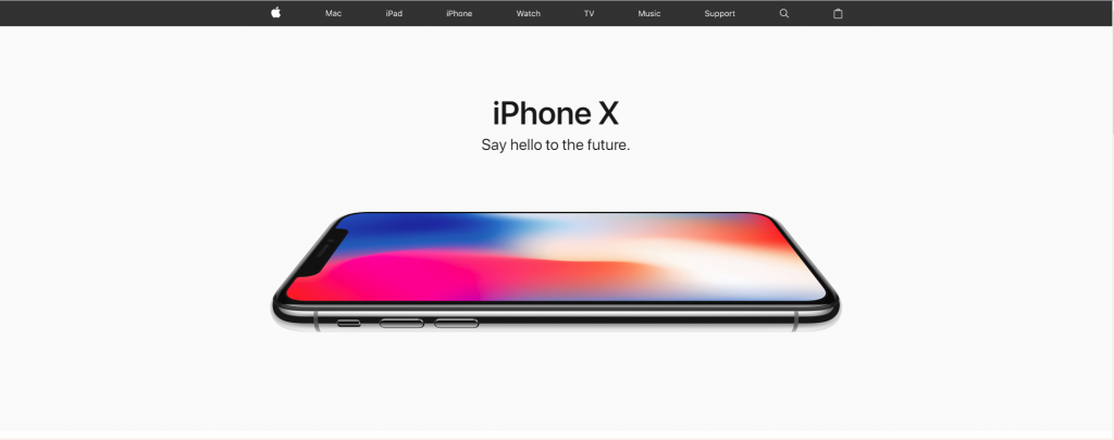
Apple has one of the cleanest website designs. Notice the all white background, suggesting simplicity and newness, and the glossy gray header which make us associate the website with something stylish but at the same time serious and elegant.
Web Animation Design
Bruno La Versa, the senior digital designer at Lightful, says, “storytelling and personality is something that new and old brands are working on in order to capture users attention, and animations are starting to play a bigger role in this.”
Users like to be engaged and entertained, and the use of cinemagraphs, animations and GIFs are becoming an integral part of ecommerce websites.
When it’s done well, animation can transform a good project to a great one.
More Adventurous Colors
The colors and the graphics are the first things your visitor sees. Choosing the right colors is a very important aspect when creating brand and website. Every color has its own meaning attached. We’ll introduce you to some of them:
- Orange – comfort, warmth, creativity, fun, enthusiasm, youth
- Green – nature, life, health, good luck, freshness
- Blue – security, trust, professionalism, success, seriousness
- Purple – power, wisdom, magic, mystery, fantasy, royalty
- Pink – youth, innocence, softness, calming effect
- White – purity, innocence, clearness, simplicity
- Black- stylish, elegant, strength, depth, gloom
Making the most of mobile
Mobile-first is not just an airy principle but something that needs to be baked into the core design process. There are over 1.2 billion mobile web users across the globe.

If your site is good on a mobile device, it translates better to all devices. More importantly, a mobile-first approach is also a content-first approach.
Kinetic E-mails
Use CSS3 and HTML to create interactivity within an email. As a result, kinetic design provides more a website experience within an email, giving users the opportunity to interact with the content and explore different product offerings. Many digital marketing agencies are using this method to achieve great results for their clients who need digital marketing services.
This trend stems from the fact that users are so comfortable with the UI language of mobile apps and websites, that they’re happy to see it in other places, including email.
About Electricbot -

Deprecated: Function the_author_description is deprecated since version 2.8.0! Use the_author_meta('description') instead. in /var/www/html/wp-includes/functions.php on line 6031
Transformative Ecommerce Web Development and Digital Marketing Agency- Specializing in branding, web design, web development, SEO, and strategic marketing solutions for Magento2, WP & WooCommerce, Shopify, other Ecommerce powered platforms, custom apps, and more!
Call- 1-201-565-3050

